This is part two of an ongoing discussion about N. A. Schofield's article Pattern Grading found in the Sizing in Clothing book. Part one is here.
My initial reaction to the idea of grading from body measurements was, "Well, of course we should." And in fact, we do for children's clothing. It seemed rather obvious to me to look at children's clothing as a model. Children's sizing is based on the idea of growth, meaning that the measurement intervals between sizes are not always consistent.
Let's look at an example for a 4-6x size range.*
For sizes 4, 5, 6, 6x
Chest: 23, 24, 25, 25.5
Waist: 21.5, 22, 22.5, 23
Hip: 23.5, 24.5, 25.5, 26.5
The grade works out to be, choosing size 5 as the base size:
Chest: 1, 0, 1, 1.5
Waist: 0.5, 0, 0.5, 0.5
Hip: 1, 0, 1, 1
In this example, we have a 1" chest grade, except for size 6x which is 1.5". The waist is a 0.5" inch grade and the hip returns to a 1" grade for all sizes. Each body measurement area has it's own grade.
In women's clothing a 2" grade means that the interval change between the sizes will be 2" for chest, waist, and hips. Though even this isn't true across all brands, and you will find variations. (IMO, this is a good thing)
I don't know the history of women's sizing well enough to explain how this mode of practice came to be nor exactly why. It is clear that it does make grading, especially hand grading, much easier in practice. It is also unclear to me that grading is the source of our fitting woes. Nevertheless, it does make sense to me to go back and look at body measurements and devise a more precise grade rule.
The question then becomes, which body measurements do we use? In my children's example above, the numbers are still nice and easy to work with. The body measurements have been intentionally manipulated to be easy to work with. Raw measurement data was averaged, sorted, and studied to arrive at some numbers. Those numbers were not easy to work with, so a group of industry professionals sat down and made them that way. They modified certain measurements by about 1/8" to achieve consistency. Their modifications were rather minor and easily fall within a statistical margin of error. If you read their reasoning, it makes sense. This manipulation of measurement data for ease of use continues today in more modern measurement studies. It seems deceitful, but at the end of the day is infinitely practical. ASTM D4910 inherits this method of data handling from the measurement studies done in the 1940s, but does provide some updated measurements.
Looking at the Misses body measurement chart, ASTM D5585, it seems to be arranged and handled in the same way as the children's body measurement chart. IOW, the chart does not show a 1, 1.5, or 2 inch grade in the body measurements. It is a lot like the children's example above. There does seem to be a disconnect between measurement data and grading, at least on the surface. Individual companies will decide how to interpret and implement measurement data, and therefore their grade rules. (IMO, I think this is a good thing). And some will use a 2 inch grade, and some will not.
So what measurement data did Schofield use? She rejected the ASTM charts and created her own version of measurements derived from body measurement studies. This presented a problem because measurement studies do not always include the measurements needed for pattern making and grading. Schofield did not normalize the data, in other words make it easy to work with. Also she had to figure out how to deal with missing measurement data. I no longer have a copy of the article and can't look back, but Schofield selected certain measurements over others. How and why she handled those measurements puzzled me.
I believe Schofield's goal was to remove the idea of maintaining an ideal proportion or predictable pattern shape. She wanted to see what the body measurements really did between sizes.
Her results were almost predictable. More on that later.
*These measurements come from the withdrawn child measurement standard CS151-50. Measurements are in inches.
Showing posts with label Process. Show all posts
Showing posts with label Process. Show all posts
April 16, 2015
August 11, 2014
Knitting: Myrtle Cardigan pt. 6
I'm not sure if it is an error in the pattern or my interpretation. I just joined the sleeves by knitting across the row and following the lace pattern. At this point I think the pattern is telling me I should be on row 2 of the lace repeat where I start the armhole decreases. I'm on row 3. I did not know how to join the sleeves into the work without knitting across. This means I will work row 3 and begin sleeve decreases on row 4 (decreases are supposed to occur on the pattern rows). I don't think it will make much difference but the instructions left me a bit perplexed. I read through everything twice more and I followed everything right up until the join sleeves instruction.And then I had a head slapping moment. You CAN do decreases on the same row as joining sleeves to the body. So I ripped back - thank goodness for that lifeline that I put in just prior to adding the sleeves - and followed the instructions in the pattern on joining the sleeves. And then because it had been so long since I had worked on this, I worked the lace charts in the wrong order. I had to rip back again and start over.
I can safely say that I am on my way. I can also confirm that working only one repeat of the lace up the middle of the sleeves was also the right move. It makes doing the sleeve decreases so much easier. I have worked far enough that I have one extra repeat of the lace in the body. Now to do one more before decreasing for the neck. Fingers-crossed that I have enough yarn.
After working on this for over a year, I think I can see myself actually finishing this.
February 25, 2014
Applying Elastics in A Swimsuit or Leotard
I was asked a while back to write a post on elastic application for a swimsuit. So the following is a pictorial demonstration on how I do it. I hope it will be helpful to someone.
I don't overlap the elastics instead a have the ends touch each other. This means I cut the elastic the exact length I need - nothing extra.The reason I don't overlap the elastics is to eliminate bulk and since it is stitched through I am not worried about it coming undone or shifting. I do overlap elastic ends for elastics placed in casings. Most patterns will give you an amount to cut for each area and they usually include an overlap amount (I subtract that out). But, you may find you need to adjust the length depending on the stretch and memory or return of your elastic. If I'm working with a questionable elastic I will sew up a sample and make incremental adjustments. I have learned a more calculated method of finding percentages/ratios and such but I can't be bothered by this and it gives me a headache.

The elastic is sewn together using a wide zigzag with a tight stitch length (close to buttonhole stitch length).
Next, I marked the leg in four equal sections. I learned from patternschool.com that elastics placed in modern stretch fabrics should be sewn in by stretching the elastic over 4 equal sections. This differs from information found in basic pattern-making books which have you leave the front elastic unstretched in 1:1 ratio and the back stretched with remainder of elastic in a sense creating what I feel a bubble butt. This unstretched and then stretched method was developed when fabrics for swimsuits were not as stretchy as today.
Elastics were also marked in four equal sections. I used the seam as one mark, hence only 3 pins.
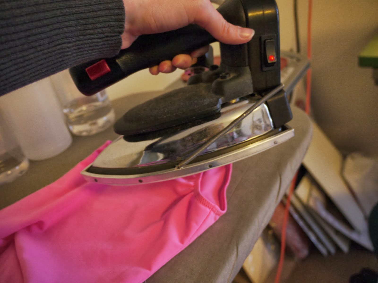
Here elastics are pinned into both legs and ready to sew.
I start my sewing in the crotch area so the outside leg area will look nice and even with no back stitching or overlapped stitching. This is also where I placed the elastic seam (or butt up elastic ends). I sew using a medium width zigzag 3.5-4 and about 3 in length.
Initial application of elastic is done.
Next, I folded the elastic over to the inside and sewed with the same zigzag stitch while stretching the elastic evenly.
I like to steam the elastic back into shape. You can also wash and dry (in the dryer) if it is suitable for the fabric. This leotard is made from nylon Lycra and I am choosing to line dry it.
All done. One more note, when sewing through elastic use knit elastic not braided. Knit elastic can be sewn through without stretching out of shape. 1/4" wide is appropriate for children's swimsuits and 3/8" is better for women's.
I don't overlap the elastics instead a have the ends touch each other. This means I cut the elastic the exact length I need - nothing extra.The reason I don't overlap the elastics is to eliminate bulk and since it is stitched through I am not worried about it coming undone or shifting. I do overlap elastic ends for elastics placed in casings. Most patterns will give you an amount to cut for each area and they usually include an overlap amount (I subtract that out). But, you may find you need to adjust the length depending on the stretch and memory or return of your elastic. If I'm working with a questionable elastic I will sew up a sample and make incremental adjustments. I have learned a more calculated method of finding percentages/ratios and such but I can't be bothered by this and it gives me a headache.

The elastic is sewn together using a wide zigzag with a tight stitch length (close to buttonhole stitch length).
Next, I marked the leg in four equal sections. I learned from patternschool.com that elastics placed in modern stretch fabrics should be sewn in by stretching the elastic over 4 equal sections. This differs from information found in basic pattern-making books which have you leave the front elastic unstretched in 1:1 ratio and the back stretched with remainder of elastic in a sense creating what I feel a bubble butt. This unstretched and then stretched method was developed when fabrics for swimsuits were not as stretchy as today.
Elastics were also marked in four equal sections. I used the seam as one mark, hence only 3 pins.
I start my sewing in the crotch area so the outside leg area will look nice and even with no back stitching or overlapped stitching. This is also where I placed the elastic seam (or butt up elastic ends). I sew using a medium width zigzag 3.5-4 and about 3 in length.
Initial application of elastic is done.
Next, I folded the elastic over to the inside and sewed with the same zigzag stitch while stretching the elastic evenly.
February 03, 2014
Pattern drafting in LibreCAD
At the start of the new year I commented about trying to figure out what to do next. I described my feelings as reaching the end of one road and trying to decide which road to take next. You might assume there were only a few options, but in reality there are many. One option was to look at languishing projects to pick back up. I have two rather large projects. One will take me many years, the other is about half done.
The really large project is sodaCAD. I started a software project back in 2010, but let it drop because I lacked the skills to work on it. SodaCAD is my attempt at an open source pattern making software. Most commercial or enterprise level pattern making software packages are very expensive and have onerous maintenance fees and licensing. I've always wanted to provide an alternative.
After much research and a few different attempts, I stumbled upon LibreCAD. LibreCAD is a free alternative to AutoCAD. Commercial pattern making packages have AutoCAD at its core. LibreCAD contains many essential CAD drawing functions already, so it is a perfect foundation to build on. I actually learned how to draft patterns using AutoCAD in college. What I lack is programming skills, but that is slowly coming.
Before I can work on optimizing LibreCAD, I had to test it out and actually try drafting a pattern to test its capabilities. It took a bit of time, but I managed to draft a bodice front.*
LibreCAD is by no means the ideal solution (not yet!) for this kind of work. It is, in many ways better than Adobe Illustrator or Inkscape. Illustrator and Inkscape lack precision and efficiency. Inkscape in particular, tends to be fuzzy when it comes to numbers. Say you draw a square that is 25 x 25, but you move one side out 1 inch. Now you have a rectangle that is 25 x 25.95. LibreCAD has no issues with precision. It does lack efficiency for pattern making, so I made many mental notes for improvement.
LibreCAD is available for use now on Windows, Mac, and Linux. If you do decide to try it out, I would recommend watching some video tutorials on YouTube. The interface and drawing functions take some learning. I have no idea how long it will take to get SodaCAD ready for use.
*This pattern piece is available in sodaCAD source files for demonstration and testing purposes.
January 03, 2012
T-shirt pattern quest pt. 3 : Sewing up the first sample
The next step in recreating my favorite t-shirt pattern is to test out some different construction options by sewing up a sample. This sample will also be used to double check fit. I began by testing some binding options on some scraps. I eventually discovered the best method for my machines that gave the best looking results.
Before stitching the neckbinding to the t-shirt, I stitched one shoulder and overedged one edge of the neck binding.
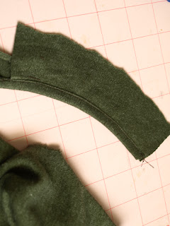
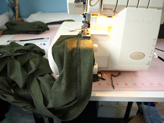
In the picture below I am stitching the binding strip to the neck. The binding strip is on top so that I can stretch it as it goes through the machine. The shirt is supported by the table. Don't let it hang down in front of the machine or gravity will do more stretching of the shirt than you intend. I did edge finish one edge of the binding strip by serging. I didn't have enough green thread, so some of it is in black.
Next, I followed the same steps in stitching the binding to the sleeve hem edge. These sleeves show about how much I stretch the binding as it went through the machine.
I then stitched the remaining shoulder seam closed through the neckbinding. This means there is a visible seam at the shoulder. This type of shoulder - neckline construction is also visible on the original t-shirt.
A few last words on the binding. The original shirt had a double fold binding, which is difficult to reproduce at home without the proper folders and adjustments to your machines. The binding I did is less bulky and easier to execute with home sewing equipment and it turned out just fine.
April 13, 2008
Grading Complex Styles pt. 1
Part 1 of this grading series will make more sense if you have a copy of Jack Handford's Professional Pattern Grading book. Unfortunately, the book is now out of print. Still, this entry may be helpful in grading complex styles, especially part 2...
An anonymous reader left this comment:
This is a good question and can be confusing. The first thing I had to do was go back and look at Handford's book to see those red lines. Sometimes when I read a technical book my eyes glaze over and I skim until I find the info I am looking for. To be honest, I have had to study Handford's book several times to grasp what he is saying. In any event, I couldn't recall those red lines....
The red lines are illustrated on page 1-2 of Handford's book. He uses the red lines to indicate where a pattern grows or shrinks. The rest of the book has more illustrations of basic pattern pieces that show this. The key is to read page 3:
In other words, a grader could draw those lines of distribution on each pattern piece and then cut the pattern apart to spread or overlap them for the next size. He is absolutely right that such a task would be extremely time consuming, error prone and tedious. This is the failure of the Price/Zamkoff book on grading because this is how they explain grading. It was the primary reason I was so confused about grading too. If you were to grade by hand, could you imagine making duplicate copies of your base pattern so you could cut it apart? You would then need to carefully align the pieces, tape them securely, redraw the pattern, and cut it out. Then you would have to start the whole process over again for the next size. Yikes!
I don't mean to be so hard on Price/Zamkoff because they explain the concept of grading correctly. The problem is that it is not practical, even in a CAD environment.
I am not sure why Handford places those red lines in his illustrations other than to illustrate where the growth is occurring as you grade using his method. In his method, you move a pattern piece a certain direction at each grade point. The grade points are related to those red lines but are actually located at a pattern edge, usually a corner or mid-point.
Anyway, the reason I didn't remember seeing those red lines is because I ignored them. As a CAD grader I simply select a point and enter in the amount of growth. In my head I know a piece is growing in the middle of the pattern even when I assign the growth to an outside corner or point.
Anyway, I have blathered too long.... The commenter is correct that with complex styles the growth/shrinkage must be placed properly. Handford illustrates a slightly more complex style of a bodice with midriff on pages 93-94. The pieces are taped together with strips of tagboard and graded at the same time. On page 89 Handford makes the suggestion of placing the style on a form to determine where growth/shrinkage should occur. While his suggestion is valid, it is difficult to make the conceptual leap from a 3D form with lines to a table top with flat pattern pieces.
I have never done this. Partly because I have only graded children's pattern pieces. There have only been a handful of styles that I would consider very complex. Since I did this on CAD I had the luxury of playing around with the grading until I felt it was correct. I came up with my own method that works for me. It is not much different from putting a jigsaw puzzle together and only involves a little bit of math.
CAD makes grading complex styles very easy. Unfortunately, the night is getting late and so a complete explanation will have to wait. For now, you must know your total width and length grades, say for a bodice pattern piece. If you have a bodice with a midriff and the total length grade is 1" (I don't know I am making this up...), divide the total length grade between the two pieces so that the growth looks proportionally correct.... Anyway, more later...
An anonymous reader left this comment:
I love your blog. Thank you so much for all the information. I've recently started grading patterns. I can grade simple styles by following Handford or other books' steps no problem. But when it comes to complex designs, such as clothing that has unusual shapes and consists of multiple panels, I have trouble placing the "distribution lines" (red lines in Handford's book) on the patterns. Handford suggests by putting the patterns on the mannequins and draw the red lines. But sometimes it isn't practical as I'm using a CAD program.
Any suggestions?
This is a good question and can be confusing. The first thing I had to do was go back and look at Handford's book to see those red lines. Sometimes when I read a technical book my eyes glaze over and I skim until I find the info I am looking for. To be honest, I have had to study Handford's book several times to grasp what he is saying. In any event, I couldn't recall those red lines....
The red lines are illustrated on page 1-2 of Handford's book. He uses the red lines to indicate where a pattern grows or shrinks. The rest of the book has more illustrations of basic pattern pieces that show this. The key is to read page 3:
Obviously the cutting and spreading or overlapping of each part of each pattern to grade it one size up or one size down would be far too time consuming and invite much chance for error to be practical.
In other words, a grader could draw those lines of distribution on each pattern piece and then cut the pattern apart to spread or overlap them for the next size. He is absolutely right that such a task would be extremely time consuming, error prone and tedious. This is the failure of the Price/Zamkoff book on grading because this is how they explain grading. It was the primary reason I was so confused about grading too. If you were to grade by hand, could you imagine making duplicate copies of your base pattern so you could cut it apart? You would then need to carefully align the pieces, tape them securely, redraw the pattern, and cut it out. Then you would have to start the whole process over again for the next size. Yikes!
I don't mean to be so hard on Price/Zamkoff because they explain the concept of grading correctly. The problem is that it is not practical, even in a CAD environment.
I am not sure why Handford places those red lines in his illustrations other than to illustrate where the growth is occurring as you grade using his method. In his method, you move a pattern piece a certain direction at each grade point. The grade points are related to those red lines but are actually located at a pattern edge, usually a corner or mid-point.
Anyway, the reason I didn't remember seeing those red lines is because I ignored them. As a CAD grader I simply select a point and enter in the amount of growth. In my head I know a piece is growing in the middle of the pattern even when I assign the growth to an outside corner or point.
Anyway, I have blathered too long.... The commenter is correct that with complex styles the growth/shrinkage must be placed properly. Handford illustrates a slightly more complex style of a bodice with midriff on pages 93-94. The pieces are taped together with strips of tagboard and graded at the same time. On page 89 Handford makes the suggestion of placing the style on a form to determine where growth/shrinkage should occur. While his suggestion is valid, it is difficult to make the conceptual leap from a 3D form with lines to a table top with flat pattern pieces.
I have never done this. Partly because I have only graded children's pattern pieces. There have only been a handful of styles that I would consider very complex. Since I did this on CAD I had the luxury of playing around with the grading until I felt it was correct. I came up with my own method that works for me. It is not much different from putting a jigsaw puzzle together and only involves a little bit of math.
CAD makes grading complex styles very easy. Unfortunately, the night is getting late and so a complete explanation will have to wait. For now, you must know your total width and length grades, say for a bodice pattern piece. If you have a bodice with a midriff and the total length grade is 1" (I don't know I am making this up...), divide the total length grade between the two pieces so that the growth looks proportionally correct.... Anyway, more later...
Labels:
Grading,
Growth,
Patternmaking,
Process,
Proportion,
Sewing Patterns
March 06, 2008
Tutorial: Reduce/Remove Sleeve Cap Ease
I have written an additional entry on sleeve cap ease. After reading this entry be sure to check out Reduce/Remove sleeve cap ease pt. 2.
Melissa wrote some comments on my blog entry A Problem with Cap Sleeves:
Just a few more words before you get to the drawings. This is just my method - Armstrong's is similar. My hope is to just illustrate the principle and not hard fast rules. You can have ease, if you choose, thus the tutorial is on how to reduce or remove the ease. You can use this same method to fix the patterns from the Big 4 - which notoriously have too much sleeve cap ease.
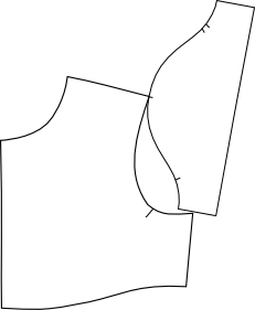 Before you can remove/reduce sleeve cap ease, you need to know how much ease the sleeve already has. To do this you need to "walk" the sleeve cap along the armscye - without seam allowances. This is one of the few times I actually remove seam allowances when pattern making because they actually might get in the way. Align the center sleeve notch with the shoulder seam and walk the pattern along until you get to the underarm seam. Armstrong does this procedure just the opposite by starting at the underarm seam and moving toward the shoulder. Either way will work and her method is probably better. I usually do this in a CAD environment and my brain says start at the shoulder. It doesn't really matter so do what you think is right.
 More walking.
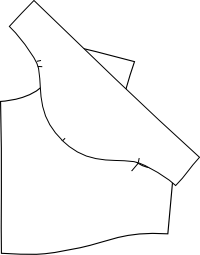 Still walking. You can see at this point that my underarm notches meet up. This won't be true in the real world - this is just how my drawing ended up. When I am done altering the sleeve, I move the notches where I need them to be. Right now my goal is to get the sleeve cap and armscye to be the same distance. This is where the Armstrong method might work better for you as the underarm notches don't move.
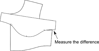 Finally done walking. Now measure any of the sleeve cap that is left over. This is how much ease you have on the front. Yes, sleeves have a front and a back and I only walked my sleeve along the front armscye. You will need to repeat the procedure since most of you will have assymetric sleeves. My sleeves tend to be symmetric for children so I only have to walk the pattern on one side. Make sense? Now that you know how much ease you have, you can decide how much to remove.
 This is where things can get a little fiddly... There are a few different ways to remove sleeve cap ease. I usually use a combination of these methods because I want to maintain a nice sleeve cap shape. Not too flat and not too round. My eyes have been trained to recognize a good sleeve cap shaping and it is not something I can pass along to you. You will have to experiment a little bit to see what works best. Try to keep the convex and concave curves balanced (again, how to explain that?). In this drawing I show two places to reduce ease. The first is to shorten the bicep line by moving in the underarm seam. Armstrong's extra 2 inches is too much for children. It may be too much for adults too. It all depends on your desired fit. The next place to remove ease is to lower the sleeve cap height. With my cap sleeve, I lowered the sleeve cap height at least 1/2 inch and re-drew the cap. Again it depends on your fit and the shape of your sleeve to begin with.
 Another way to reduce sleeve cap ease is to split the pattern and overlap it - similar to these drawings (remember I am only working on the front side so don't forget to do the back). Redraw the sleeve cap. This method reduces the bicep but may help preserve the cap shaping.
 As I stated before, I probably did a combination of these three methods so that I didn't do anything too drastic. It will take subtle changes to distribute the ease reductions to retain a nice sleeve cap shaping. Finally, check your notch placement on the sleeve and move it to where it should be.
Any questions?
Melissa wrote some comments on my blog entry A Problem with Cap Sleeves:
I was really excited when I found your blog on the children's sleeve draft from Armstrong's book. I have been working on a project for weeks now and I'm having a lot of trouble with the sleeve. Starting with the Basic Sleeve Draft, I found there was too much ease and took 2cm off the bicep measurement when I read that you take the ease out. But my worry is the shaping of the sleeve cap, it just doesn't look right to me. Even before I took out the ease, it looked like the under arm shaping was really short. When I compare it to bought patterns and the pictures in the book, it just looks like the notches are really low, and there is a very small amount left to go under the arms. I have tried a zillion things and it's been driving me crazy and I hope you might be able to shed some light on my sleeve shaping problem. Thanks so much!I responded:
One thing that is probably causing you trouble is the placement of your notches. The notches should match up with the notches on your bodice. They don't necessarily imply that is where you should start easing. Home sewing patterns use those notches to indicate the start and end of easing and thus some of the confusion.This is my promised tutorial. Even though I prefer the Armstrong shaping for cap sleeves, it still leaves too much ease. If you draft the sleeve exactly as outlined in her book, you will have to correct your draft by reducing or removing that ease. On page 68 (second edition) she explains that a sleeve should measure 2 inches bigger than the bicep and have an average of 1.5 inches of sleeve cap ease. On pages 69-70 she illustrates how to reduce/add ease to your sleeve. As I have stated before 1.5 inches of ease is simply too much. Some fabrics require 0.25 to 0.5 inches of ease, but not much more. Armstrong does use the notches to indicate easing. If your sleeve has no ease then the notches are just match points.
And just as an aside, There is more than one way to remove ease. You can lower the sleeve cap, fold out extra (like a tuck), or shorten the bicep at the underarm seam. I'm sure I did some combination of the above.
Just a few more words before you get to the drawings. This is just my method - Armstrong's is similar. My hope is to just illustrate the principle and not hard fast rules. You can have ease, if you choose, thus the tutorial is on how to reduce or remove the ease. You can use this same method to fix the patterns from the Big 4 - which notoriously have too much sleeve cap ease.
 Before you can remove/reduce sleeve cap ease, you need to know how much ease the sleeve already has. To do this you need to "walk" the sleeve cap along the armscye - without seam allowances. This is one of the few times I actually remove seam allowances when pattern making because they actually might get in the way. Align the center sleeve notch with the shoulder seam and walk the pattern along until you get to the underarm seam. Armstrong does this procedure just the opposite by starting at the underarm seam and moving toward the shoulder. Either way will work and her method is probably better. I usually do this in a CAD environment and my brain says start at the shoulder. It doesn't really matter so do what you think is right.
 More walking.
 Still walking. You can see at this point that my underarm notches meet up. This won't be true in the real world - this is just how my drawing ended up. When I am done altering the sleeve, I move the notches where I need them to be. Right now my goal is to get the sleeve cap and armscye to be the same distance. This is where the Armstrong method might work better for you as the underarm notches don't move.
 Finally done walking. Now measure any of the sleeve cap that is left over. This is how much ease you have on the front. Yes, sleeves have a front and a back and I only walked my sleeve along the front armscye. You will need to repeat the procedure since most of you will have assymetric sleeves. My sleeves tend to be symmetric for children so I only have to walk the pattern on one side. Make sense? Now that you know how much ease you have, you can decide how much to remove.
 This is where things can get a little fiddly... There are a few different ways to remove sleeve cap ease. I usually use a combination of these methods because I want to maintain a nice sleeve cap shape. Not too flat and not too round. My eyes have been trained to recognize a good sleeve cap shaping and it is not something I can pass along to you. You will have to experiment a little bit to see what works best. Try to keep the convex and concave curves balanced (again, how to explain that?). In this drawing I show two places to reduce ease. The first is to shorten the bicep line by moving in the underarm seam. Armstrong's extra 2 inches is too much for children. It may be too much for adults too. It all depends on your desired fit. The next place to remove ease is to lower the sleeve cap height. With my cap sleeve, I lowered the sleeve cap height at least 1/2 inch and re-drew the cap. Again it depends on your fit and the shape of your sleeve to begin with.
 Another way to reduce sleeve cap ease is to split the pattern and overlap it - similar to these drawings (remember I am only working on the front side so don't forget to do the back). Redraw the sleeve cap. This method reduces the bicep but may help preserve the cap shaping.
 As I stated before, I probably did a combination of these three methods so that I didn't do anything too drastic. It will take subtle changes to distribute the ease reductions to retain a nice sleeve cap shaping. Finally, check your notch placement on the sleeve and move it to where it should be.
Any questions?
February 20, 2008
Design a clothing line with a plan
If you watch Project Runway or believe any of the stereotypical Fashion Designer drivel, you may think a line is designed by pure inspiration. A designer goes to a museum and is inspired by a piece of artwork and can magically create 5-7 pieces that all work together. Or perhaps a designer flips through some swatches and tosses some to an assistant to make samples out of. This kind of thinking is silly nonsense and will lead to disaster.
It is true that a designer can be inspired by a piece of artwork, a fabric print, color, etc. But unless one designs with a plan, or end goal, it will only be an exercise in design for design's sake. A design plan should follow some basic steps and answer basic questions:
It is true that a designer can be inspired by a piece of artwork, a fabric print, color, etc. But unless one designs with a plan, or end goal, it will only be an exercise in design for design's sake. A design plan should follow some basic steps and answer basic questions:
- Review the past line.
- What sold best/worst?
- Customer comments
- Returns
- Review past goals and set new ones.
- Did you meet sales expectations?
- What are my sales goals for this season?
- How is my budget?
- Set design budget for the next season.
- Shop the market between seasons.
- What are my competitors selling?
- What are their price points?
- Do I hang with them?
- Shop for fabric/trims. (this is where I find my "inspiration".
- Does the fabric express the brand?
- Does it fit within the price point for raw materials?
- Determine number of styles/pieces.
- Can any styles be carried over in new color/print?
Subscribe to:
Comments (Atom)


