Showing posts with label Style. Show all posts
Showing posts with label Style. Show all posts
October 09, 2013
Adapting a block pattern into something else pt. 1 : Noting changes for the new style
A block pattern is a sewing pattern that has been proven. It is a pattern that has been trued, perfected and finished with seam allowances. The pattern has been sewn up and tested for fit. In other words, a block pattern just works. A block pattern becomes a part of a pattern file which can be used to make other patterns.
In the industry we rarely draft from scratch. Instead we modify existing patterns (or blocks) into something else. Some pattern making gurus talk about using slopers. Slopers are basic patterns drafted from body measurements and do not have seam allowances. Industry level pattern makers use block patterns, with seam allowances on, to make patterns for new styles*. It saves time.
It's easier than you might think to do this and this is just one example. I'm sure other pattern makers have their own procedures. My own procedures adapt to whatever it is I'm working on and whether I'm using CAD or traditional methods.
The problem:
I have this much loved cashmere sweater jacket. I snagged it off a sales rack a couple of years ago and I absolutely love the cut and fit. You know, the perfect layering piece, warm and soft for those cool days. I usually clean it by running it through the dryer using a Dryel kit. This last time was a disaster as I had left a piece of chocolate in a pocket. Chocolate ended up all over the sweater and everything else. So, I decided to run it through the hand wash cycle on my washer. That was a mistake. While the chocolate did come out, the sweater shrank. It shrunk just enough that I'm not sure I can wear it anymore. It made me very sad. And yes, I know better. I should have hand washed it.
The solution:
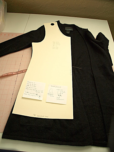
I always said that once this sweater was in pieces, I would make up a pattern to make a new one. So here it is. I recently finished up my t-shirt pattern, a block pattern ready to go. I began by carefully laying out the sweater and positioning the front t-shirt pattern on top. I then used scraps of paper to note the differences between the sweater and the pattern. You can see my notes in the picture above.
The notes** usually say something like: Move SH pt out 1/2" (left arrow) ; or Extend hem (down arrow) 3 inches. These notes are sometimes accompanied with drawings as needed. If I was working in CAD, I would just mentally note the differences and make the changes as as I went along. Since I'm drafting with pencil and paper, the notes are essential.
The next step is to trace off the t-shirt pattern and start applying the changes. More on that later.
*There are a lot of pattern making myths out there. I'm trying to keep this blog entry very focused but I'm happy to answer pattern making questions and myths in future posts. Please leave your question or comment below.
**These notes eventually find their way to my pattern piece catalog. I assign a pattern piece number, note the style/pattern piece that the new piece came from, and then tell what changes were applied and any other relevant details. Blank forms for managing patterns are available in my Pattern Making bundle or in the book with complete instructions.
January 04, 2013
Review: Simple Modern Sewing pt. 1

Simple Modern Sewing one of the new how-to sew books at my library. I was excited to review this because Japanese sewing books have a reputation for precision and design that elevate the average sewing book. The Pattern Magic
This book is written by Shufu To Seikatsu Sha. The photography and styling of the designs really grabbed my attention. I personally found the designs very appealing and in this case something that I would actually make and wear. In comparison, I did not find any of the designs in the books I reviewed previously inspiring enough to put in the work necessary to make them up. The book consists of 8 simple patterns that can be used to create 25 garments. Each grouping of patterns can be mixed and matched interchangeably to create the different styles.
The book is divided up into three general sections. The first is the photography/inspiration section that shows each of the style variations. The second is general pattern and sewing instruction. The third contains detailed cutting and sewing instruction for each style variation. This includes a pattern layout, diagrams, and a list of sewing instructions.
The styles in the book are sized for the average Japanese woman. The average American woman may find some of the styles a bit on the small side. Some of the styles are intended to have a lot of wearing ease, so the largest size may fit some American women anyway. There is a size chart and finished measurements for each style, which helped me determine the correct size to trace.
Overall I really like the styles in this book. I selected the wrap blouse, shown on the front cover to sew up as a test for the dress. The biggest downfall of the book is the pattern sheet. It is nice to see the patterns are printed on sturdy white paper rather than tissue paper. But the pattern sheet is a dizzying array of overlapping pattern pieces in multiple sizes in solid black lines. All the patterns and all the sizes are solid black lines. Burda patterns are similar, but they are much easier to sort out. Each style is a different color and the sizes are differentiated by different line types.
To finish up part 1 of the review, the book is inspiring and lovely to look at. The general sewing information and detailed sewing information appear to be adequate for sewists who have some experience. The cutting diagrams and pattern prep require a bit of work. Because of the difficult pattern sheets, I don't know that I can recommend the book for beginning sewists. The styles are simple enough that one could find similar patterns from the Big 4 without the hassle of interpreting the pattern sheet.
Anyway, I've traced off the blouse and dress pieces and begun the pattern checking process. So far I've spent maybe 4 hours just in prep work. Updates as I work my through it.
July 15, 2010
Potato Sack Dress
My local town in Idaho has a little museum and this dress was on display with a fun story. The story is that high school freshman girls had to wear a potato sack dress for a full day as part of their initiation in the 1950's. Back then potatoes were bagged in burlap sacks. I couldn't imagine wearing this dress for a full day. One girl felt sorry for a freshman and sewed ruffles on one of the dresses to pretty it up.
The tradition has long since disappeared as potatoes are now packed in paper sacks. Some local resident donated this to the town museum along with a picture of the girls in the dress.
The tradition has long since disappeared as potatoes are now packed in paper sacks. Some local resident donated this to the town museum along with a picture of the girls in the dress.
May 05, 2008
What is a clothing line?
In terms of fashion, a line is a group or collection of 5-7 related pieces. Sometimes it is more. Sometimes the pieces are actually sets because children's lines tend to be sold as sets (bringing the total pieces to around 10-20). The point is that the pieces are related. The pieces have similar colors, tones, mood, feel. From a manufacturing end, the pieces repeat fabrics to minimize and utilize fabric purchases. The clothes have a consistent fit.
Some say a line tells a story. That is the more difficult thing to interpret or even observe. Not too many customers care about your source of inspiration unless it is an integral value that they share. Usually customers care about price, fit, comfort, and finally, "Does it look good?".
To muddy the waters, newer children's designers on Ebay and Etsy do collections based around a fabric grouping. They offer up one of a kind outfits that utilize a particular theme or fabric print. They will call that one outfit or piece a collection. Some of these designers evolve and manage to present a true line. In any event, they are inspiring some RTW collections.
A good example of a well merchandised line can be found at Tea Collection. They do some things really well. They have repeated fabrics. The pieces can be mixed and matched. It has a consistent feel, colors, and look. Each piece looks like it belongs. You could even say it tells a story. Can anyone else see it?
What lines are out there that you like? Post links in comments.
Labels:
Definitions,
Design,
Fashion,
Fashion Industry,
Line,
Manufacturing,
Market Research,
Style
March 27, 2008
Peasant Blouse Pattern Conquered
There are a few styles that have always perplexed me. The peasant top with an elastic neck and elastic sleeve cuff has always driven me crazy. When I relied on pattern making books to develop the pattern, I would start off with a kimono style. Bad move because it will create a neckline on the bias. On most styles, this will happen by default. But try tunneling elastic into a neckline casing that is on the bias? It doesn't happen. At least not well. Funny thing is, I have a RTW sample with tunneled elastic on a curved neckline. I am fairly certain the factory that sewed it had a set-up with a 1/4" rolled ball hemmer with an elastic feed. Anyhoo. I don't have one of those nifty set-ups.
The secret is that the neckline should be on the straight grain. I received a helpful tip from the blog Just Tutes with her peasant blouse tutorial. I didn't copy her method exactly. I had to study why it works and where her measurements came from. I drafted a peasant blouse off of my basic blocks and my measurements to get the same basic shape as hers. Amazingly, it worked well enough and I just need to grade my pattern for other sizes.
Labels:
Clothing for Children,
Fashion,
Patternmaking,
Sewing Techniques,
Style
November 09, 2007
Standard Pattern Blocks- Flat vs. Classic
Tiki left some questions in comments and I thought I would address them in a separate blog entry.
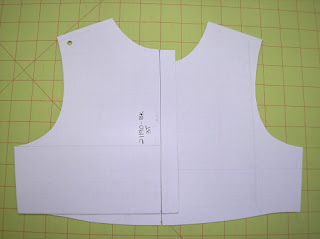
My basic blocks are a variation of the flat method. The armholes and shoulders of the front and backs pieces are identical. The body widths match (the long vertical line indicates the center back/front). The flat fit is a little more boxy and loose. My fit is not too boxy, but it does allow for some growth. You can see the fit of this bodice on one of my dresses. The patterns are not too boxy because the side seams do taper inward and my front waist has some curve. Aldrich's patterns have a straight side seam and waistline. BTW, I am not done refining the shape of this pattern - I am considering narrowing the shoulders and reducing the armhole. You have to start somewhere with your patterns, and they will evolve as you refine your fit.
 This is a set of classic bodices sized three month. You can see the small armhole - there is little room to draw a nice curve. The back armhole is nearly a straight line. These drafts are based off of Aldrich's book. A classic block would be more appropriate for larger sizes.
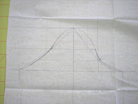 This is a corresponding sleeve with an asymmetric sleeve cap. The sleeve cap seems really high and the curves are abrupt, IMO. These blocks could certainly work, but they require more refining. I opted to modify my blocks so they were semi-fitted and flat. The curves are easier and sewing is easier.
There is a relationship with children's body shapes and the flat method. Young children are simple round cylindrical shapes until about the age of 5 and it makes sense to keep the patterns simple.
This is a topic I am still researching and trying to understand. I hate to label flat blocks as a standard because there are several possible methods that may be considered "right" or the "standard". Pattern making is considered a technical, rigid system, but don't be afraid to do things your way. I learn things from those who do not have formal training and are not afraid to do things a little different. Sure there are certain accepted standards for labeling patterns or placing notches. Acceptable shaping and fit is open to interpretation.
I am reworking some of my patterns and have both Aldrich's and Armstrong's books as well. As you mentioned, I have noticed that my own kids' clothes from various manufacturers are drafted "flat" as Aldrich describes it, with the front and back patterns basically identical except for the neckline, but was wondering if you could explain more why that is the standard.Here is a picture of what Tiki is talking about. Aldrich is the only other person I know of that addresses this topic. It is true that most childrenswear manufacturers work off of flat blocks, especially for infants. Aldrich only presents it for infant casual clothing. But I have seen variations of the idea spanning all children's sizes.

My basic blocks are a variation of the flat method. The armholes and shoulders of the front and backs pieces are identical. The body widths match (the long vertical line indicates the center back/front). The flat fit is a little more boxy and loose. My fit is not too boxy, but it does allow for some growth. You can see the fit of this bodice on one of my dresses. The patterns are not too boxy because the side seams do taper inward and my front waist has some curve. Aldrich's patterns have a straight side seam and waistline. BTW, I am not done refining the shape of this pattern - I am considering narrowing the shoulders and reducing the armhole. You have to start somewhere with your patterns, and they will evolve as you refine your fit.
I have read the discussion of armhole and sleeve shaping from Kathleen's blog and book and was wondering if the standard in the children's wear industry is due to simplicity in drafting, etc (perhaps because there is more ease built into the design of the garment itself) or if there is a specific anatomical/physical reason that makes drafting the asymmetrical sleeve/armhole unnecessary in children's wear. I guess, in other words, is that only the standard in loose children's garments or would drafting a more fitted children's garment with the same symmetrical sleeve still be correct/standard?I can't say for sure why this is the standard. It is definitely not something I learned in school, but rather on the job. Tiki's instincts are probably right. There is a simplicity in the drafting of flat pattern blocks, and it does save some time. There is a physical limitation too. The smaller the size, the less practical it becomes to draft a classic block. A flat block gives some wearing ease and allows for growth. Children, after all, grow and a little extra ease allows the clothing to be worn longer. And yes, you can draft a more fitted bodice block with symmetrical armholes/sleeves. That is what I did with my patterns because it is what looked right to me. Here are some pictures of a classic, fitted block with asymmetric armholes (click on images for a better view).
 This is a set of classic bodices sized three month. You can see the small armhole - there is little room to draw a nice curve. The back armhole is nearly a straight line. These drafts are based off of Aldrich's book. A classic block would be more appropriate for larger sizes.
 This is a corresponding sleeve with an asymmetric sleeve cap. The sleeve cap seems really high and the curves are abrupt, IMO. These blocks could certainly work, but they require more refining. I opted to modify my blocks so they were semi-fitted and flat. The curves are easier and sewing is easier.
There is a relationship with children's body shapes and the flat method. Young children are simple round cylindrical shapes until about the age of 5 and it makes sense to keep the patterns simple.
I'm having difficulty understanding from Aldrich's book what makes the "flat" block or "classic" block more appropriate for a particular style, so I wondered what was standard practice here in the industry. I hope this makes sense.I look at it this way. Flat blocks are good for casual styles, like t-shirts. Classic blocks are good for more formal looks. Flat blocks are good for infant sizes, classic for older. Your fit and look defines your design and you can opt for either method. Usually I see a modified classic block for fit, but with symmetrical armholes and shoulders (perhaps more of a convention rather than a standard). I have seen some designers use only classic blocks and others only flat. Really, the decision is up to you.
This is a topic I am still researching and trying to understand. I hate to label flat blocks as a standard because there are several possible methods that may be considered "right" or the "standard". Pattern making is considered a technical, rigid system, but don't be afraid to do things your way. I learn things from those who do not have formal training and are not afraid to do things a little different. Sure there are certain accepted standards for labeling patterns or placing notches. Acceptable shaping and fit is open to interpretation.
November 01, 2007
A Problem With Cap Sleeves
Over the last couple of months I have struggled with drafting a toddler cap sleeve. For whatever reason, my infant cap sleeve came off without a hitch. I tried some quick and dirty pattern making by grading the infant sleeve up to 24M and using it as my toddler base. The shaping just didn't work and I had to actually draft a 3T sleeve. I used the opportunity to compare draft instruction between Aldrich and Armstrong
 and these are my results.
The actual draft instructions for either cap sleeve are fairly simple and easy to draft. Even so, I didn't like the shaping and resultant styles of either sleeve. I'll try to explain the differences of each. I had a stronger preference for the Armstrong version, but I still modified hers considerably.
The top sleeve is the Aldrich version, the bottom my modified Armstrong sleeve. The Aldrich sleeve is very straight - such a sleeve results in a large sleeve cuff opening. Her sleeve is not a fitted cap sleeve. The instructions were easy to follow, I just had a styling disagreement.
I much prefer a fitted cap sleeve. The basis of the sleeve draft must start with a regular sleeve block. Just draw in a style line similar to what you see in the photo for the shaping at the hem. There are some minor refinements detailed in the Armstrong book. The problem with the Armstrong draft is that the sleeve cap height was too high for a toddler. I decreased the cap height by about a good 1/2". Walk the sleeve cap along the armscye and adjust any length differences. Armstrong states there should be 1-1 1/2" of ease in the sleeve cap, which is simply too much. My sleeves have virtually no ease because I removed it. Sometimes the fabric calls for 1/4-1/2" of ease, but not anymore. A sewing operator will return a bundle with too much sleeve cap ease. It is just too difficult to sew in an industrial sewing. And in IMO, it doesn't do anything for fit or wearing ease. Armstrong's draft instructions are easy to follow and you can make any adjustments you prefer after you have the shape you want.
If you look closely, you will notice that my sleeves are symmetrical. This is because my bodice armhole shapes are identical for the front and back. This is typical in the industry for infant and toddler styles. In older children, this is not true and Aldrich's basic sleeve drafts illustrate the differences very well. Kathleen Fasanella has blogged much on the proper shaping of sleeve caps.
 Here is a sewn sample. On the right is the Aldrich cap sleeve and my modified Armstrong sleeve is on the left. Can you see the difference in the sleeve shaping and cuff openings? The sleeve on the right is good for t-shirts and casual styles. The sleeve on the left is better for more formal, fitted styles. I have a few minor refinements to make and at least one more sew test and I will have my toddler cap sleeve done! (I am debating on adding 1/4" back to the sleeve cap height, overall I like it).
Either book will get you a basic cap sleeve. My eyes prefer the fitted style. Any questions? Anyone need draft instructions?
The actual draft instructions for either cap sleeve are fairly simple and easy to draft. Even so, I didn't like the shaping and resultant styles of either sleeve. I'll try to explain the differences of each. I had a stronger preference for the Armstrong version, but I still modified hers considerably.

The top sleeve is the Aldrich version, the bottom my modified Armstrong sleeve. The Aldrich sleeve is very straight - such a sleeve results in a large sleeve cuff opening. Her sleeve is not a fitted cap sleeve. The instructions were easy to follow, I just had a styling disagreement.
I much prefer a fitted cap sleeve. The basis of the sleeve draft must start with a regular sleeve block. Just draw in a style line similar to what you see in the photo for the shaping at the hem. There are some minor refinements detailed in the Armstrong book. The problem with the Armstrong draft is that the sleeve cap height was too high for a toddler. I decreased the cap height by about a good 1/2". Walk the sleeve cap along the armscye and adjust any length differences. Armstrong states there should be 1-1 1/2" of ease in the sleeve cap, which is simply too much. My sleeves have virtually no ease because I removed it. Sometimes the fabric calls for 1/4-1/2" of ease, but not anymore. A sewing operator will return a bundle with too much sleeve cap ease. It is just too difficult to sew in an industrial sewing. And in IMO, it doesn't do anything for fit or wearing ease. Armstrong's draft instructions are easy to follow and you can make any adjustments you prefer after you have the shape you want.
If you look closely, you will notice that my sleeves are symmetrical. This is because my bodice armhole shapes are identical for the front and back. This is typical in the industry for infant and toddler styles. In older children, this is not true and Aldrich's basic sleeve drafts illustrate the differences very well. Kathleen Fasanella has blogged much on the proper shaping of sleeve caps.
 Here is a sewn sample. On the right is the Aldrich cap sleeve and my modified Armstrong sleeve is on the left. Can you see the difference in the sleeve shaping and cuff openings? The sleeve on the right is good for t-shirts and casual styles. The sleeve on the left is better for more formal, fitted styles. I have a few minor refinements to make and at least one more sew test and I will have my toddler cap sleeve done! (I am debating on adding 1/4" back to the sleeve cap height, overall I like it).
Either book will get you a basic cap sleeve. My eyes prefer the fitted style. Any questions? Anyone need draft instructions?
Labels:
Cap sleeve pattern,
Clothing for Children,
Fashion,
Fitting,
Patternmaking,
Sleeve,
Style
September 12, 2007
Making Children's Clothes by Joan Moloney
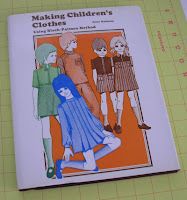 I received my copy of Making Children's Clothes Using Block-Pattern Method (1971) by Joan Moloney
Just so you know, this book has no measurement charts, detailed drafting instructions, or sewing instructions. Think of it as looking on the back of a home sewing pattern envelope. The author shows the pattern pieces that make up a style next to an illustration or photograph of that style. The text is full of ideas but little how-to.
On the positive side, this is one of the few books I have seen that show all of the pattern pieces that make up a complete style. This may help designers who struggle with the complete design. Also, the book clearly illustrates the shapes of the pattern pieces. Sometimes that is all one needs to draft your own version. The illustrations are charming and I will add this book to my collection as a possible source of inspiration.
 The author does describe how to make your own children's dress form, although briefly. Her version made me laugh for a second and then I wondered if I should be scared. It may give you an idea of how to make your own dress form. I did make my own, which I am using now. Children do not have the patience to be fit models for very long - so I do recommend obtaining dress forms at some point. Still, it is worth the time to try clothing on a child because you may notice differences in how the fabric drapes on a moving child.
This is not a must-have book to add to your reference collection. Used copies are available through Amazon for as little as $1 plus shipping so there is really no reason to not add it either.
Labels:
Books,
Design,
Inspiration,
Patternmaking,
Product Review,
Style
August 22, 2007
The color purple for children's clothes
For years I have heard rumors about the color purple and children's clothing, and more specifically girls dresses. Specifically the rumors suggested that purple was associated with death. That children who pass away are buried in purple in certain countries. Sales of purple dresses seemed to lag behind other colors, and some retailers refused to carry the color. If you shop the market you will probably not see much purple in the infant/toddler range.
Purple is an odd fashion color. It seems to run through the fashion cycle rather quickly. Either you love it or hate it. Of course a designer must consider the shade and intensity and other such things. And yet one hot color combo for girls is orange and purple. I haven't figured it out.
Read more about the color purple at Wikipedia and Sensational Color.
Labels:
Clothing for Children,
Color,
Customs,
Design,
Fashion,
Purple,
Style,
Traditions,
Trends
August 18, 2007
Careful - This Bib is Patented
I have seen a few children's accessory designers make this bib. I can't say for sure if they have made it exactly, but there is enough similarities that caution should be advised. There are a few children's apparel/accessory products that have been patented. I don't generally like the idea of patenting these kinds of products because they are usually so simple. With a quick search I found over 200 patents on bibs and related items and some of them are extremely simple products. If you do register a patent, you also must be willing to defend it legally. This bib is patented by Nancy Sell with the bib being sold at Wal-Mart.
Other things to consider with patents. They take time and money to prepare. This bib was "invented" in 1993 and the patent filing wasn't completed until 1996. There are some interesting related inventions of a coat and an apron that had similar pockets.
 This style of bib is called a "crumb catcher". It has a folded pocket on the bottom that is secured with strategically placed snaps. The bib is made of a vinyl type material on the face and a fuzzy fabric on the back.
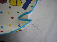 Here is a close-up of the folding used to create the pocket.
I haven't decided if this was really worth going through the process of obtaining a patent. It is interesting enough that I traced it off for further study and that is when I noticed the label with patent info. If you do patent a design you must include the patent info on a label. Anyway, if you do make a "crumb catcher" bib, just make sure it doesn't violate this patent.
Labels:
Accessories,
Bibs,
Design,
Intellectual Property,
Patents,
Style
May 22, 2007
Clothing for Children: Chapter 3, part 3
Essentials in the Layette
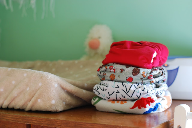
This section discusses what is needed in an infant layette. Diapers are considered one of the most important layette items to have, especially cloth diapers. Disposable diapers were available in 1949 but they were bulky and used mostly during travel. Disposable diapers have certainly improved since 1949 and many people use them. However, do we want to trade convenience for landfills brimming with diapers that don't decompose? It's past time to return to cloth diapers.
I will be the first to admit that I haven't paid much attention to cloth diapers. I have designed special occasion dresses for several years. When I think of cloth diapers, I think of diaper flannel. It's soft and absorbent. But there are many more choices today, not only in fabric but print and design. Suzanne from The Good Mama gave me a rundown of fabrics used in her diapers. Bamboo velour and organic cottons are both renewable resources, and soft, comfortable fabrics. The prints are adorable too.
In 1949 the typical diaper was a large rectangle of flannel fabric that was folded a certain way and pinned on with diaper pins. The diaper was then covered with rubber pants, wool soakers, or water-repellent batiste pants. The authors encouraged limited use of diaper covers because they did not breathe, especially the rubber pants. Wool soakers were preferred because they kept the baby dry and breathed. The wool soakers were made from a knit fabric.
The cloth diapers of today are engineered much better. They have closures like snaps and velcro - no need for diaper pins. They are absorbent and rarely leak, so no need for plastic diaper covers. They are constructed to withstand lots of washing. The fabrics are soft and more durable. The price may be a little higher, initially, than disposables but they will last a long time.
The rest of the chapter discusses all the rest of layette essentials, which is pretty common knowledge.
Labels:
Clothing for Children,
Comfort,
Diapers,
Fashion,
Product Review,
Style,
Trends
May 14, 2007
Clothing for Children: Chapter 3, part 1
I am going to do a series of posts on Chapter 3 of Clothing for Children because each section deserves its own emphasis. This is perhaps the best chapter in the book. It discusses standards, layettes, diapers, various pieces of clothing, etc.
The first section of the chapter is titled Standards for Infants' Clothing, pages 103-104. Most of the information is still relevant today and designers should keep these things in mind when designing. If you have an opinion or question of how these standards apply today, please leave a comment.
From a practical stand point, #2 is true for the majority of children's clothing sales. But as your price point moves up, the more likely that your customer may be willing to buy a dry clean or hand wash item. A higher price point customer expects specialty fabrics and they are willing to buy them despite special care. Still, I think higher-end designers tend to go overboard with feather boa trimmings and sparkles. There is a happy medium somewhere.
The point of #3 is that babies need to have their temperature moderated. Not too hot or too cold. It would be easy to assume that babies need to be bundled up all of the time, but it is better to remove or add layers as needed.
Finally, the authors give some sage advice. They suggest buying minimum amounts of clothing before the baby arrives. It is hard to know the size of the baby until born, plus babies grow fast. It is wiser to invest in clothing as needed. At baby showers moms are overwhelmed by lots of clothing sized 0-3M. If you do buy clothing to give, try buying clothes sized 6-12M as that size is mostly overlooked.
The first section of the chapter is titled Standards for Infants' Clothing, pages 103-104. Most of the information is still relevant today and designers should keep these things in mind when designing. If you have an opinion or question of how these standards apply today, please leave a comment.
1. A baby's clothes should be made of material that is soft, pliable, and absorbent. Garments worn next to the skin, especially, should not be irritating.Most of the standards seem pretty straight forward and practical. You can read my blog entry on Clothing for Children, Chapter 9 for my opinions about standard #7. I am not sure how to take standard #8. Most of the designs I have seen that allow for growth (such as an extra deep hem, tucks, etc), have been ugly. Plus, by the time a child has grown, the garment is worn out. I would like to see a practical solution to allowing for growth.
2. The material should be durable, easily laundered, and, whenever possible, it should not require ironing.
3. The clothing should be light in weight but sufficient to keep the body at the normal uniform temperature of 98.6 degrees. The material and garment should both be constructed to allow ventilation.
4. The design of the garments should make them easy to put on and to remove. If you plan to make the garment, the design should be one easy to make.
5. The garments should be comfortable and allow freedom of movement.
6. The clothing should be well constructed with smooth flat seams and have easy simple fastenings.
7. The design, as well as any decoration, should be simple. Trimming should not add to the bulk of the garment. Baby's clothing should be attractive, but this does not depend on elaborateness.
8. The garments should be designed to allow for growth and development of muscles.
9. The garments should be safe.
From a practical stand point, #2 is true for the majority of children's clothing sales. But as your price point moves up, the more likely that your customer may be willing to buy a dry clean or hand wash item. A higher price point customer expects specialty fabrics and they are willing to buy them despite special care. Still, I think higher-end designers tend to go overboard with feather boa trimmings and sparkles. There is a happy medium somewhere.
The point of #3 is that babies need to have their temperature moderated. Not too hot or too cold. It would be easy to assume that babies need to be bundled up all of the time, but it is better to remove or add layers as needed.
Finally, the authors give some sage advice. They suggest buying minimum amounts of clothing before the baby arrives. It is hard to know the size of the baby until born, plus babies grow fast. It is wiser to invest in clothing as needed. At baby showers moms are overwhelmed by lots of clothing sized 0-3M. If you do buy clothing to give, try buying clothes sized 6-12M as that size is mostly overlooked.
December 26, 2006
Fixing the neckline on Butterick 6030 sewing pattern
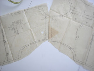
I started to deconstruct the Butterick 6030 pattern for my boy's shirt pattern fix. At this point, I am thinking it would be so much easier to start from scratch. More glaring problems showed up after looking closer. In the picture on the right, I lined up the shoulders of the shirt. I know, I did not align the pattern pieces along their true seam lines. In production sewing, though, the pieces are lined up along their cut edges, not sewing lines. If I did this, the sewing operator would bring this back to me as a mistake. Those edges should meet.
Also, look closely at the armhole shaping. The front armhole has a nice curve and the back is rather straight and flat. This was how I was formally trained in classic pattern making for adults. Adults require more shaping in front than in back around the arm. In children's pattern making, the patterns are made the same front to back, except for the neckline. This means the side seams, shoulders, and armhole shapings are exactly the same. Children do not require the extra shaping front to back. This is a typical industry method for children's patternmaking, especially infant and toddler. It is called the flat method by Aldrich.
Another problem not shown in the picture above are the side seams. The side seams swing out at the hem. I am guessing the patternmaker did this to accomodate an infant's protuding belly. Many babies have a belly until they get older. The assumption is that width must be added to accomodate the extra girth. The problem with Butterick's pattern is that it creates an a-line shirt. The photo on the pattern cover shows a plaid shirt. The side seams should be straight in order to match stripes and plaids. A basic shirt block already has extra wearing ease at the chest and waist. There is no reason to add even more room at the waist. I drew my side seams straight.
Here is my modified neckline. You can see the v-shaping more clearly. I rounded the neck, raised it at center-front, and made it smaller (my changes are in red).
 A 24 month old's neck measures about 10.125 inches. Butterick's neck measurement for a 24M is 15" - my modified neck is 14". I am thinking it is still too large. This is just my first rough pattern - I have a long way to go. Later, I will trace these off, with seam allowances. You can see I removed the cumbersome facing and created a double fold facing. Also, my back pattern is going to be exactly the same as my front, except for the neckline. You can see my back neckline above my front (red) neckline. I am going to double check neck measurements by measuring some necklines on some RTW shirts. When all else fails, see what your competition is doing.
Labels:
Patternmaking,
Quality,
Refashion,
Style,
Technical Design,
Tutorials
December 17, 2006
Button style can add interest to a design
 Sometimes design inspiration comes from the most utilitarian part of a garment. And yet, if one pays attention to such small details, you can take an ordinary piece of clothing and turn it into something special.
This tiny little flower button jazzed up an otherwise boring knit jacket. The jacket is made from a french terry knit with a ruffle trim on the hems. If this had a regular two-hole button, the jacket would have been plain boring.
A regular two-hole button costs less than one cent each. They are generally one of the least expensive items found on an item of clothing. That changes when you start to add novelty buttons. There are tons of special and extra special buttons available. Most manufacturers can't afford wholesale button costs of 20 cents a piece or more. This flower button would be less than 5 cents because it is still rather basic. Special buttons are saved for the front of the garment where they can be seen.
If you truly want to set your garment apart, pay attention to details like buttons on the back of a dress, for example. Special occasion girl's dresses sometimes have interesting and fun button details. Buttons on the back may match a colored sash, skirt band, or trim. Maybe use some of the buttons as part of an embellishment. Can you imagine using a different thread color to sew the buttons on this jacket? How about a soft yellow center to correspond with a flower embroidery on a pocket? Boutique children's designers can certainly play with this seemingly small detail.
While the jacket is not cutting edge fashion, this manufacturer did some interesting things that I may blog about in the future. Knits can be difficult to work with, especially when topstitching or adding a woven fabric trim. Knits and wovens do not like to work together happily. One or the other ends up stretched or distorted. You can see how nicely this trim lays with no stretching of the knit jacket.
This jacket was obviously well loved. It is worn and stained. Even so, the previous owner did not clip the threads left by the manufacturer. You can see one of five errant threads in the picture above. This is a big pet peeve of mine. Any finishing and inspection should include clipping threads.
Labels:
Buttons,
Design,
Fashion,
Inspiration,
Style,
Technical Design
July 26, 2006
Fashion Challenged Wal-Mart
Evidently Wal-mart's sales of it's women's clothes is down. This according to a recent Business Week article. It's no surprise really. I almost never buy clothing at Wal-Mart. There are a couple of reasons. One, the fitting rooms are too close to the registers. They are small, dirty, and cramped. If I feel I should try something on before buying it, I won't buy it. The last few pieces I bought I should have tried on - the mediums were really sized as a large. Oh well, at least it was only $5 wasted and a lesson learned.
In the book Nickled and Dimed on Not Getting by in America, author Barbara Ehrenreich worked covertly for Wal-mart. As a sales associate in the women's department, she spent most of her time putting away returns from the fitting rooms, store returns, and cleaning. She never spent any time assisting customers or pushing sales. According to her anecdotal evidence, 80-90% of the clothing taken to the fitting room is rejected. This points to fitting issues.
The next reason I don't buy clothing at Wal-mart is the clothing looks cheap. Some of the styles were cute, but the finishing details were lacking or the colors were too garish. One outfit had simple, exposed serged hems instead of a rolled or blind hem. This screams cheap. I also know this won't hold up in the wash.
Girls dresses also scream cheap. Their isn't enough fabric in the gathered skirts to look like a skirt. Ribbon and flower trims are wrinkled. Same issue with the garish colors. To be fair, the basic children's clothing is fine. You can get a great value on Carter's brand clothing. But skip the Rose Cottage label.
At one company, I helped create private label merchandise for the Rose Cottage Brand. It is true that Wal-Mart has greatly improved its quality program. But they are still missing the boat. In order to get the product to hit their price point, you have to reduce gather ratio's, remove linings, reduce trimmings. When you are done with the dress, it looks incredibly cheap. For a couple dollars more, you could get a dress that looks like a real dress at another store.
So the secret for Wal-Mart's success is to take a cue from Target. Create affordable merchandise with improved quality, the right colors, the right fit, and be mistaken for a more expensive piece. Oh, and move the clothing department away from the main drag of the store. Do I really want my neighbors to know I buy my underwear at Wal-mart?
Labels:
Design,
Fashion,
Style,
The Business End,
The Retail Side,
Walmart
Subscribe to:
Comments (Atom)

