December 20, 2006

A boy's shirt pattern fix for Butterick 6030


About a year ago I was asked to make a a white shirt for an infant boy's christening. I didn't have the time to draft the pattern myself, so I turned to a ready-made pattern. Out of the big 4 pattern companies only one had a "traditional" woven shirt pattern. I could have saved myself a lot of stress by drafting the pattern anyway. I didn't really have time to fix the problems in the pattern either and I was disappointed by the results. Here is a picture of the pattern envelope. Maybe you can spot the problems too.

The first obvious problem is the collar and neck. The collar points splay apart too far. The collars don't meet at the center front neck and the front neck seems too low. On top of that the collar looks proportionally too large. Compare the drawings with the actual pictures. The drawings show a convertible collar with a stand in the back.

The problems become more obvious when you study the pattern pieces (sorry the pictures are fuzzy - tissue paper is hard to photograph).


1. On the front bodice piece the front neck is a V-shape and the neck is too low at center front. The front neck is just too big. To correct this problem the neck needs to be raised at center front and the front neck needs more curve.

2. Notice the large, built-in front facing. It is at least 2" wide, way too large for an infant shirt. This should have had a traditional built-in, double fold facing found in adult shirts. I will illustrate this later.

3. The collar is too wide. Of course, this piece has the obligatory 5/8" seam allowances. The collar has little shaping, except for a slight narrowing at the back neck. It is essentially a rectangle.

4. When I sewed the sleeves in the first time - there was too much ease. The shirt has dropped sleeves. There should be no ease in this style of sleeve at all. Also notice the strange jog on the right side seam. I have no idea why the sleeve turn back would be extended longer on one side than the other. I drew a red arrow down to indicate that the sleeve cap needs to be flatter.

5. The other major issue is the sizing used by the pattern company. The infant patterns are sized S-M-L-XL, divided up by height and weight. To me, those size labels are almost meaningless. I had to pull out my size charts to figure out what size matched up with the appropriate ages, heights, and weights. The sizing doesn't break-down very well because their height-weight measurements didn't match up with any of my industry charts. This is my best guess on Butterick's sizing:

Small=3-6M
Medium=6-9M
Large=12-18M
X-Large=24M

I have wanted a basic infant shirt pattern for a while, so I am going to take this pattern and fix it. The first step is to trace off the pattern pieces, minus the seam allowances. Normally, I do my pattern drafting with the seam allowances on - typical of the industry. In this case, I want to redo the seam allowances so they are appropriate for the seam. I will add 1/4" seam allowances for the neck and collars and 3/8" for everything else. The hem will have a 1/4" rolled hem - 1/2" hem allowance. I will fix the neckline and correct the sleeve. Finally, I will redraft the collar completely - the original is useless.

Once the pattern is fixed, I will re-sew it up. The hope is, it will look better and be easier to sew.

December 17, 2006

Button style can add interest to a design

Small flower buttonSometimes design inspiration comes from the most utilitarian part of a garment. And yet, if one pays attention to such small details, you can take an ordinary piece of clothing and turn it into something special.

This tiny little flower button jazzed up an otherwise boring knit jacket. The jacket is made from a french terry knit with a ruffle trim on the hems. If this had a regular two-hole button, the jacket would have been plain boring.

A regular two-hole button costs less than one cent each. They are generally one of the least expensive items found on an item of clothing. That changes when you start to add novelty buttons. There are tons of special and extra special buttons available. Most manufacturers can't afford wholesale button costs of 20 cents a piece or more. This flower button would be less than 5 cents because it is still rather basic. Special buttons are saved for the front of the garment where they can be seen.

If you truly want to set your garment apart, pay attention to details like buttons on the back of a dress, for example. Special occasion girl's dresses sometimes have interesting and fun button details. Buttons on the back may match a colored sash, skirt band, or trim. Maybe use some of the buttons as part of an embellishment. Can you imagine using a different thread color to sew the buttons on this jacket? How about a soft yellow center to correspond with a flower embroidery on a pocket? Boutique children's designers can certainly play with this seemingly small detail.

While the jacket is not cutting edge fashion, this manufacturer did some interesting things that I may blog about in the future. Knits can be difficult to work with, especially when topstitching or adding a woven fabric trim. Knits and wovens do not like to work together happily. One or the other ends up stretched or distorted. You can see how nicely this trim lays with no stretching of the knit jacket.

This jacket was obviously well loved. It is worn and stained. Even so, the previous owner did not clip the threads left by the manufacturer. You can see one of five errant threads in the picture above. This is a big pet peeve of mine. Any finishing and inspection should include clipping threads.

December 12, 2006

Care/Content Label Example in Two Languages

Writing a care/content label can be difficult. There are government regulations, department store requirements, company budgets, and a lot of info to fit in a small space. Every company comes up with creative solutions. If I get stuck on how to write a care label, I go shopping (or at least my closet)! I have seen a lot of good examples and poor examples of how to write a care/content label. I may blog about care/content labels in the real world on a semi-regular basis. New designers need a better understanding of labeling requirements. Since my blog focuses on children's clothing, I will try to pull labels from children's clothing. Children's clothing presents some difficulty when creating a care/content label.

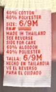
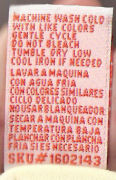
In my first example, I pulled a label from a cotton t-shirt with a screen print, sized 6-9M. I smudged out the RN# because I want to keep the manufacturer anonymous. I apologize for the pictures being a bit fuzzy - labels are harder to scan than I thought. I will do better on my next blog. The front of the label is on the left, the back is on the right.

Front of a care content labelBack of a care content label


The first thing that caught my eye about this label is the colors. The label is a folded woven, satin label with orange lettering. This kind of label is a bit more expensive than a regular printed label. I wouldn't have expected this style in an ordinary t-shirt, especially one that came from a major discounter. The label is in English and Spanish. This is a typical requirement for department and chain stores.

I had previously blogged about keeping track of production by recording some kind of information on the label. This label has a SKU # on the bottom of the reverse side of the label. It is a little unusual to see a SKU number, but it does occur. 

The only thing I would change is the repetition of the size information. The English/Spanish could be combined on one line: "Size/Talla 6/9M. It is also preferred to keep the font size for all of the characters and numbers on the tag the same size.