Showing posts with label Tutorials. Show all posts

September 02, 2008

Comparing pattern shaping and children's sizes

As many children's wear designers know, children's clothing has a lot of sizes. It can become quite the dilemma when trying to decide which sizes to offer. Some DE's offer their styles in as many as 21 sizes. Way back in 2006 I suggested a theory to reduce the number of sizes by combining or eliminating some of them. You may want to go back and review the entry Too Many Sizes and other related entries to see how I have arrived at today.

Anyway, I have tried to put the theory into practice and I have made some progress. I only offer my styles in sizes 3M to 6x. I am still working on the grades for the 4-6x styles, so I am nearly there. My sizes break down like this:

3M, 6M, 9M*, 12M, 18M

24M/2T, 3T, 4T/4

5, 6, 6x

I don't really consider the 9M as a true size. It is a half size between the 6M and 12M and is graded by splitting the grade between the 6M and 12M. The 24M and 2T are essentially the same as are the 4T and 4 - those sizes have been combined for grading purposes. My website still delineates the combined sizes as separate sizes.

This blog entry is not a discussion on the why and wherefores of children's sizing - a surprisingly complex and controversial topic. Instead, I wanted to show a possible grading/pattern problem that shows up now and then. I have been grading and comparing my basic bodice blocks. You should do this too because someone will eventually see the problem and it will be more difficult to fix.

I have drafted my basic bodice block three times, in each of my sample sizes for each of my size ranges - 12M, 3T, 5. (BTW, you can't use the same pattern piece and grade it in all the sizes. Believe me, that is one large headache). The next step is to grade each range separately. Keep in mind that each sample size will have slightly different shaping, but the general shape and proportion should be related.

Before getting too far, the outer fringes of each size range should be compared. For example, the size 18M should be smaller than the 24M/2T and the size 4T/4 should be smaller than the 5. Originally, I had graded the size 4T and 4 separately. In other words the 4T was based off the 3T sample and the 4 was based off the 5. The reason I combined the 4T and 4 was because the shape and overall size was so similar it was a duplication in effort, and I also ran into the problem where the 4T was actually larger than the 4. If you do separate out the sizes than the 4T must be smaller than the 4. If you don't check your grades, someone will bring two dresses to you and say the patterns are wrong, size labels are switched or some other problem.

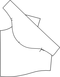
In the photos below you can see the problem more clearly. In the top picture, the size 4 is laying on top of the 4T. You can see the 4 is smaller than the 4T. In the bottom picture the 4T is on top of the 4 and it is clearly longer with a larger armhole.
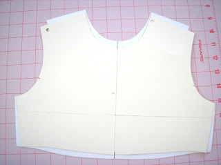
Comparing pattern shaping and sizing of a bodice frontComparing pattern shaping and sizing of a bodice back
To solve this problem, I have been reworking my toddler patterns. I started by combining sizes 4T and 4 so I have one less size to grade. Next my toddler bodices were redrafted to have a shape similar to the 5 (less boxy, smaller armhole). Finally, I regraded the toddler patterns. This is still a work in progress, but the results are much better - each size is progressively larger.

I had the same problem with my size 18M and 24M/2T. In this case it wasn't a grading problem. Instead my infant patterns were proportionally too long compared to the toddler. I fixed this by shortening the bodice slightly.

Anyway, the point is that you should make sure and check the sizes on the outer fringes of each size range and make adjustments so that each size is progressively larger. You can adjust the grade rules (much easier in CAD, btw) or change the shape of the patterns.

(I am ignoring the idea that in the real world an 18M child could be larger than a 24M child. If that is the case, a parent would buy a larger size than 18M and just complain about the craziness of US sizing standards. When I did private label programs for the big box retailers their grade/POM charts progressively got larger with each size. Logically it makes sense even if reality is very different. Anyway, you can allow your sizes to overlap if you want, you'll just need to have an explanation as to why when a sewing contractor becomes confused.).

March 06, 2008

Tutorial: Reduce/Remove Sleeve Cap Ease

I have written an additional entry on sleeve cap ease. After reading this entry be sure to check out Reduce/Remove sleeve cap ease pt. 2.

Melissa wrote some comments on my blog entry A Problem with Cap Sleeves:

I was really excited when I found your blog on the children's sleeve draft from Armstrong's book. I have been working on a project for weeks now and I'm having a lot of trouble with the sleeve. Starting with the Basic Sleeve Draft, I found there was too much ease and took 2cm off the bicep measurement when I read that you take the ease out. But my worry is the shaping of the sleeve cap, it just doesn't look right to me. Even before I took out the ease, it looked like the under arm shaping was really short. When I compare it to bought patterns and the pictures in the book, it just looks like the notches are really low, and there is a very small amount left to go under the arms. I have tried a zillion things and it's been driving me crazy and I hope you might be able to shed some light on my sleeve shaping problem. Thanks so much!
I responded:

One thing that is probably causing you trouble is the placement of your notches. The notches should match up with the notches on your bodice. They don't necessarily imply that is where you should start easing. Home sewing patterns use those notches to indicate the start and end of easing and thus some of the confusion.

And just as an aside, There is more than one way to remove ease. You can lower the sleeve cap, fold out extra (like a tuck), or shorten the bicep at the underarm seam. I'm sure I did some combination of the above.
This is my promised tutorial. Even though I prefer the Armstrong shaping for cap sleeves, it still leaves too much ease. If you draft the sleeve exactly as outlined in her book, you will have to correct your draft by reducing or removing that ease. On page 68 (second edition) she explains that a sleeve should measure 2 inches bigger than the bicep and have an average of 1.5 inches of sleeve cap ease. On pages 69-70 she illustrates how to reduce/add ease to your sleeve. As I have stated before 1.5 inches of ease is simply too much. Some fabrics require 0.25 to 0.5 inches of ease, but not much more. Armstrong does use the notches to indicate easing. If your sleeve has no ease then the notches are just match points.

Just a few more words before you get to the drawings. This is just my method - Armstrong's is similar. My hope is to just illustrate the principle and not hard fast rules. You can have ease, if you choose, thus the tutorial is on how to reduce or remove the ease. You can use this same method to fix the patterns from the Big 4 - which notoriously have too much sleeve cap ease.

First step in walking a pattern to match corresponding edgesBefore you can remove/reduce sleeve cap ease, you need to know how much ease the sleeve already has. To do this you need to "walk" the sleeve cap along the armscye - without seam allowances. This is one of the few times I actually remove seam allowances when pattern making because they actually might get in the way. Align the center sleeve notch with the shoulder seam and walk the pattern along until you get to the underarm seam. Armstrong does this procedure just the opposite by starting at the underarm seam and moving toward the shoulder. Either way will work and her method is probably better. I usually do this in a CAD environment and my brain says start at the shoulder. It doesn't really matter so do what you think is right.


Continue to walk the sleeve cap along the armscye More walking.


Matching the notches while walking the sleeve along the armscye Still walking. You can see at this point that my underarm notches meet up. This won't be true in the real world - this is just how my drawing ended up. When I am done altering the sleeve, I move the notches where I need them to be. Right now my goal is to get the sleeve cap and armscye to be the same distance. This is where the Armstrong method might work better for you as the underarm notches don't move.


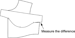
Measure any difference in length Finally done walking. Now measure any of the sleeve cap that is left over. This is how much ease you have on the front. Yes, sleeves have a front and a back and I only walked my sleeve along the front armscye. You will need to repeat the procedure since most of you will have assymetric sleeves. My sleeves tend to be symmetric for children so I only have to walk the pattern on one side. Make sense? Now that you know how much ease you have, you can decide how much to remove.

Two options to reduce sleeve cap easeThis is where things can get a little fiddly... There are a few different ways to remove sleeve cap ease. I usually use a combination of these methods because I want to maintain a nice sleeve cap shape. Not too flat and not too round. My eyes have been trained to recognize a good sleeve cap shaping and it is not something I can pass along to you. You will have to experiment a little bit to see what works best. Try to keep the convex and concave curves balanced (again, how to explain that?). In this drawing I show two places to reduce ease. The first is to shorten the bicep line by moving in the underarm seam. Armstrong's extra 2 inches is too much for children. It may be too much for adults too. It all depends on your desired fit. The next place to remove ease is to lower the sleeve cap height. With my cap sleeve, I lowered the sleeve cap height at least 1/2 inch and re-drew the cap. Again it depends on your fit and the shape of your sleeve to begin with.

Remove sleeve cap ease by splitting the pattern and overlapping Another way to reduce sleeve cap ease is to split the pattern and overlap it - similar to these drawings (remember I am only working on the front side so don't forget to do the back). Redraw the sleeve cap. This method reduces the bicep but may help preserve the cap shaping.

Remove sleeve cap ease by splitting the pattern and overlapping As I stated before, I probably did a combination of these three methods so that I didn't do anything too drastic. It will take subtle changes to distribute the ease reductions to retain a nice sleeve cap shaping. Finally, check your notch placement on the sleeve and move it to where it should be.

Any questions?

November 05, 2007

Sewing Tutorial - Set-in sleeves

This is my first sewing tutorial for sewing set-in sleeves flat - please forgive the photo intensive entry and anything that is not too clear. Here, I am testing some refinements to my cap sleeve pattern. I am doing the sewing with my domestic Singer 503 (a fabulous machine, btw). The technique is essentially the same on a 4-5 spool serger or industrial straight stitch machine. Some of this is my personal opinion, some fairly standard fabric handling techniques. Please note, my sleeve pattern has no ease.

Start sewing a sleeve with a sleeve cap against the feed dogsPlace the sleeve against the feed dogs, the body on top. Notice that I am using no pins, no basting, and no ease stitching. There is a single notch at the center of the sleeve cap. My sleeve is symmetrical front to back so there are no extra notches to indicate the back or front of the sleeve. Adult clothing would have extra notches, so make sure to match up fronts or backs or you will have a funny looking sleeve.


Hand position for sewing a sleeve without pins Do you see the placement of my hands? My left hand is holding the body and my right hand is controlling the sleeve. This is one of the major differences of industrial vs. home sewing. Home sewists like to pin the two layers together and have everything move together in lock step. With this method I can control the two layers as they move under the foot by ever so subtly pulling or pushing. It takes time, practice, and confidence in your pattern to develop this skill but it is absolutely essential.

Matching notches when sewing a sleeveThis picture just shows that the shoulder seam and the sleeve notch meet up. Another industrial technique is that the operators will tap the foot pedal. Home sewers press down on the foot pedal like they are at the races. But during certain operations, the operator can gain more control by tapping the foot pedal. This can help while going around a curve.


A set-in sleeve sewn flatThis picture tries to illustrate why the sleeve should be next to the feed dogs. If there is any ease (and it should be minimal) the feed dogs will do the work of easing for you. My sleeve has no ease so this picture isn't accurate. If there were ease, it would look something like this on the inside.


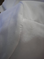
View of the sleeve capThis is a view of the top of the sleeve cap. There seems to be a few puckers, but that is a combination of poor lighting and the fabric - a poly-cotton broadcloth. The sleeve cap is actually nice and smooth.


Sew a side seam from waist to sleeve hemStitch the side seam from the waist to the sleeve hem making sure the armscye/sleeve cap seam allowances are turned toward the sleeve. The seam allowances, when turned in the right direction, will fill the sleeve cap and help give it a nice rounded shape from the outside. Some operators will allow the seams to lay in opposite directions (for bulk, they may go in opposite directions, but otherwise they shouldn't).


Finished sewn sleeveThe finished sleeve.

July 25, 2007

When do you grade sewing patterns?

Amanda left a comment/question on a previous blog about grading. I thought the answer deserved its own blog entry.
I have what is probably a stupid question. Do you do the grading before or after you add the Seam Allowance to the sloper? Part of my brain says before because you are likely to get a better line, the other says after as it would be easier. I am loving your blog, thank you so very much.
Amanda, not a stupid question at all. The only stupid question is the one not asked. There is a lot of confusion about grading and the difference between a sloper and a block. Let's throw some definitions out and then I'll answer your question.

Sloper - a basic fitting pattern used by costumers and home sewing enthusiasts. The pattern does not have seam allowances, which are added later. People who use slopers do all of their pattern making without seam allowances.

Block - A pattern used by fashion designers and pattern makers which forms the basis of future styles. A block is a perfected pattern that has seam allowances. During the pattern making process the seam allowances remain on the pattern.

Many people believe that using blocks (vs. slopers) is an advanced pattern making technique. It's not really. The pattern making process is no different when using blocks, except for not having to add seam allowances. If anything, it saves time in production settings. It is important for the pattern maker to know what the seam allowances are - which are usually drawn onto the pattern anyway. The exception might be CAD patterns which may or may not have the seam allowances drawn. My CAD patterns do not show seam allowances even though they are there. I do all of my pattern making with the seam allowances already on the pattern. Occasionally, I will turn the seam allowances off to check measurements or to match up seam lines of complex pieces. CAD has greatly simplified the manipulation of seam allowances.

Now to answer the question.... Grading should only occur after the pattern has been perfected and the seam allowances have been added. If you add seam allowances after grading you just add more work to your project and you could introduce errors. This is especially true in a factory setting.

Now in theatrical settings, I know this would never occur. A cutter (aka pattern maker) does their pattern making in the size they need and then adds seam allowances during cutting. If they need two sizes of the same style, they will grade the "slopers". Finally, they trace the pattern onto fabric and add the seam allowances while cutting. This system works in the theater but is not precise enough for apparel production.

May 12, 2007

Neckline Finishes Examples

A friend asked me about the typical neckline finishes on childrenswear. There is a difference in the type of finish between adult and children's clothing. Adult clothing utilizes either linings, facings, and occasionally a bias binding finish. Children's clothing eliminates most facings, unless they are top-stitched down. Facings get in the way of dressing a child and roll out frequently. Another option is to have a full, flat lining usually seen on special occasion dresses. The majority of neckline finishes on children's clothing consists of bias binding.

There are several advantages to using bias binding. It is inexpensive and relatively easy to apply - you eliminate extra pattern pieces and reduce fabric usage. A bias facing is relatively flat and smooth, which may increase comfort. A bias facing can be made of self-fabric or contrasting. It can become a design element.

Here are just a few examples:

Bias facing neckline finish on a dress This is a typical example. This button-front, velveteen dress has a bias facing made of the same fabric as the collar. Usually the facing is made of the same fabric as the collar, rather than the body of the garment. This is so the facing appears to blend with the collar and not show from the front. If there were no collar, the neckline would still be finished with a bias facing, but the color would match the dress instead.


Bias facing on a hooded jacket This is a sweatshirt style jacket. The bias facing is made of a cotton broadcloth that matches the decorative stitching. This is a good example of how the facing can be a design element. It also disguises an otherwise unsightly seam.


Bias facing on a childs top A bias facing used on a knit style top that has a back zipper opening. The end of the bias is turned under near the top of the zipper. No need for a special facing pattern to deal with the zipper.


An example of a facing on a neckline of a child's topThis is an example of a poorly executed use of a regular facing. The facing is much too narrow and floats up. The seam is bulky because of the ruffle sandwiched between the facing and the neck. This is a size 3-6M top and the facing and bulky neckline seam could be an irritant. The neckline seam should be serged together to reduce bulk and the facing should be top-stitched down. A bias facing would probably work better.

January 11, 2007

Disappearing Ink Pens for the Sewing Room

These disappearing ink pens are among my favorite tools. I go through several of them every year. I use them to trace around a pattern directly on to fabric for cutting. I also use them to mark stitching lines like darts, fly-fronts, or even quilting lines. It is great for marking match points in the middle of a piece. I rarely make tailor tacks or sew-baste thread markings.

In this picture, you can see how well the line shows up, even on difficult to mark fabrics like blue. This drawn line came from a pen that is nearly dead (I use them until they are dead). It works on most light to medium colored fabrics. It has difficulty with anything that is pink, red and of course black. For those colors I whip out chalk pencils or soap remnants (soap usually works better). I have used these pens on a variety of fabrics from silks, satins, laces, flannels, broacloths, to denims. I use them on personal projects and in industry settings.

The back of the package says to test on fabrics before using. I have had very few problems with the ink not disappearing. If I were to topstitch a fly, I may test it. The last pair of pants I made, the fabric had a finish on it that prevented some of the ink from disappearing. But it all came out in the wash. I wouldn't iron over the ink until it has completely disappeared - the heat/steam from the iron may set it. It would be rare for the ink to become permanent. Most of my ink lines are from tracing around pattern pieces, so they would never be seen anyway. The package states the ink disappears within 24-72 hours. I find it disappears much faster than that, especially when exposed to air. The age of the pen also determines how long the mark will last.

I have difficulty finding this exact pen in the fabric stores. They carry disappearing ink pens, but they don't work as well. For some strange reason fabric stores (the ones near me) carry Dritz marking pens, but not this one. This pen is from Dritz and I can be ordered from Amazon.

January 08, 2007

Points of Measure and Grading

In a previous grading blog, I showed the first step in developing grade rules. I usually break my measurement and grading charts into two charts. Here is an example:

An example of developing a grade rule

I usually stop at the middle chart and work the rest of the math out in my head as I grade. Some of you may want to break your measurements down even further. If a pattern piece is symmetrical, you can grade half of the pattern at a time. The third chart shows the grades for half of the pattern width.

My charts have a column on the left titled POM, or point of measure. Those points of measure should correspond to a drawing like this:

Points of measure on a pattern piece

The measurements in the top chart above are based off pattern measurements (which are made up for this example), rather than body measurement charts. The grades are developed from body measurements. To grade successfully, you will need to take a lot of measurements off your base size patterns. For a bodice pattern, you will need armhole circumference, across the shoulder neck circumference, neck width, neck depth, and possibly more. Work between your body measurements, pattern measurements, grade, and ease requirements to develop appropriate grade rules for each point of measure. BTW, if your pattern measurements are finished measurements (minus seam allowances), you can use these charts to measure finished garments while doing quality assessments.

There are standard reference grading charts available from various sources. You can refer to them to develop your grade rules, if you like, and it may save you some time. Standard grading charts are usually available for adult, most often, women's clothing. Children's grading charts are available, but I have found them less useful. There are too many variations in children's body measurements, and every company has their own set. I usually have to develop grading charts that are unique for each company. When a designer asks me to grade a pattern, I have to work off of their measurement charts and basic pattern pieces for the grade to make sense. I will compare their measurement charts with my own to make sure their measurement and grades fall within an acceptable range.

If you do use a standard reference grading chart, you will need to double check your pattern/body measurements across the range. Standard grade charts do not accommodate variations in body type that your company may try to fit.

In the next grading blog, I will begin to explain the actual process of grading.

January 02, 2007

Knits-Wovens - How to tame the stretch


Remember my previous blog on flower buttons? I promised to blog further on how this manufacturer worked with combining knits and wovens. Combining knits and wovens opens up wonderful design opportunities, that is until you try to sew the two together. The knits invariably stretch out of shape and the wovens will stubbornly refuse to stretch.

The most frustrating thing is trying to gather a skirt (with a high gather ratio) to a knit bodice. Imagine a pretty gathered taffeta skirt sewn to a stretch velvet top. While I am not going to explain every tip and trick out there, this well-loved jacket has some excellent examples of how to do this.

The most important thing to remember when combining the two is that knits will have to be stabilized in some way. This jacket has a facing which has been interfaced with a light-weight interfacing appropriate for a stretch fabric. In other words, after the interfacing is applied, the knit fabric retains some of its knit characteristics - it doesn't feel stiff as a board. The interfacing prevents the buttonholes from stretching out and the topstitching is straight and even.

As a design inspiration, you can see how the facing is an entirely different fabric. The neckline and center front seams would have been too bulky if faced with the french terry knit. Instead, they used a flower print jersey. I am sure this jacket was part of a two piece set that had a matching pair of flower print pants.

The gathered eyelet trim was pre-gathered onto a twill tape and then applied to the hem. The manufacturer could have applied a twill tape to the jacket and then gathered the trim directly to the hem. In either case, the knit fabric has to be stabilized to prevent stretching. The jacket, sleeve and pocket hems all have this gathered eyelet trim. Wow!

The manufacturer gets bonus points for their patch pocket application. The rounded pocket would have been very difficult to maintain the round shape and topstitch it without stretching. They used a 1/2" strip of interfacing around the edge of the pocket. This picture is a close-up of the inside of the pocket.

The final tip is not easily observable. In a factory, the sewing machines can be adjusted to help prevent stretching. How the fabric is fed through the machine is part of the reason store-bought knits look so good. This adjustment is often called the differential and it refers to the movement of the feed dogs. Industrial machines with differential feed have two sets of feed dogs. These feed dogs can be adjusted in how far they move back and forth and up and down, in relation to each other. The front feed dogs can either pull extra fabric or pull less in relation to the back feed. This is not to be confused with the stitch length, also controlled by the feed dogs. Few home machines, with the exception of some overlock sergers, have this ability, requiring knits to be stabilized even more when sewn. A walking-foot attachment, or machine, may help with seam distortion too. American and Efird has some good suggestions on sewing knits.

December 26, 2006

Fixing the neckline on Butterick 6030 sewing pattern

Sewing pattern shoulder alignment
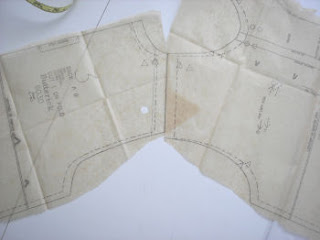
I started to deconstruct the Butterick 6030 pattern for my boy's shirt pattern fix. At this point, I am thinking it would be so much easier to start from scratch. More glaring problems showed up after looking closer. In the picture on the right, I lined up the shoulders of the shirt. I know, I did not align the pattern pieces along their true seam lines. In production sewing, though, the pieces are lined up along their cut edges, not sewing lines. If I did this, the sewing operator would bring this back to me as a mistake. Those edges should meet.

Also, look closely at the armhole shaping. The front armhole has a nice curve and the back is rather straight and flat. This was how I was formally trained in classic pattern making for adults. Adults require more shaping in front than in back around the arm. In children's pattern making, the patterns are made the same front to back, except for the neckline. This means the side seams, shoulders, and armhole shapings are exactly the same. Children do not require the extra shaping front to back. This is a typical industry method for children's patternmaking, especially infant and toddler. It is called the flat method by Aldrich.

Another problem not shown in the picture above are the side seams. The side seams swing out at the hem. I am guessing the patternmaker did this to accomodate an infant's protuding belly. Many babies have a belly until they get older. The assumption is that width must be added to accomodate the extra girth. The problem with Butterick's pattern is that it creates an a-line shirt. The photo on the pattern cover shows a plaid shirt. The side seams should be straight in order to match stripes and plaids. A basic shirt block already has extra wearing ease at the chest and waist. There is no reason to add even more room at the waist. I drew my side seams straight.

Here is my modified neckline. You can see the v-shaping more clearly. I rounded the neck, raised it at center-front, and made it smaller (my changes are in red). Corrected neckline shaping in sewing patternA 24 month old's neck measures about 10.125 inches. Butterick's neck measurement for a 24M is 15" - my modified neck is 14". I am thinking it is still too large. This is just my first rough pattern - I have a long way to go. Later, I will trace these off, with seam allowances. You can see I removed the cumbersome facing and created a double fold facing. Also, my back pattern is going to be exactly the same as my front, except for the neckline. You can see my back neckline above my front (red) neckline. I am going to double check neck measurements by measuring some necklines on some RTW shirts. When all else fails, see what your competition is doing.

December 12, 2006

Care/Content Label Example in Two Languages

Writing a care/content label can be difficult. There are government regulations, department store requirements, company budgets, and a lot of info to fit in a small space. Every company comes up with creative solutions. If I get stuck on how to write a care label, I go shopping (or at least my closet)! I have seen a lot of good examples and poor examples of how to write a care/content label. I may blog about care/content labels in the real world on a semi-regular basis. New designers need a better understanding of labeling requirements. Since my blog focuses on children's clothing, I will try to pull labels from children's clothing. Children's clothing presents some difficulty when creating a care/content label.

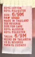
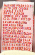
In my first example, I pulled a label from a cotton t-shirt with a screen print, sized 6-9M. I smudged out the RN# because I want to keep the manufacturer anonymous. I apologize for the pictures being a bit fuzzy - labels are harder to scan than I thought. I will do better on my next blog. The front of the label is on the left, the back is on the right.

Front of a care content labelBack of a care content label


The first thing that caught my eye about this label is the colors. The label is a folded woven, satin label with orange lettering. This kind of label is a bit more expensive than a regular printed label. I wouldn't have expected this style in an ordinary t-shirt, especially one that came from a major discounter. The label is in English and Spanish. This is a typical requirement for department and chain stores.

I had previously blogged about keeping track of production by recording some kind of information on the label. This label has a SKU # on the bottom of the reverse side of the label. It is a little unusual to see a SKU number, but it does occur. 

The only thing I would change is the repetition of the size information. The English/Spanish could be combined on one line: "Size/Talla 6/9M. It is also preferred to keep the font size for all of the characters and numbers on the tag the same size.

November 15, 2006

Creating a grading standard pt. 3

2019 notes - The original images for this blog entry have disappeared and I haven't had time to recreate them. I do have more complete examples in my ebook, The Organized Fashion Designer.  
 
I finally made my example measurement/grading charts. It took a little dancing as I had to create them in a spreadsheet, export them as a PDF and then convert them over to a jpg. Before I get too far, it may be helpful to review my previous blogs on grading: Creating a grading standard and Creating a grading standard part 2. You should have your own measurement charts handy. BTW, the measurements in my charts are real. I found them from the Sears website. I do not necessarily endorse Sears measurements as the industry standard - they were just handy (To be fair, their measurements are pretty good). Your own measurement charts should be far more complete and detailed than these for pattern development and actual grading anyway. This is the first step I take in developing actual grade rules.

Right off, I hope you notice a few important things. First, I have clearly marked my sample sizes. In this example they are sizes 10 and 10+. Each chart is labeled clearly. You would think these things should be obvious, but you would be surprised at what I have seen. Hanging off of the left side are numbers. These numbers are points of measure and should correspond to a How to Measure diagram (a future blog) and are not relevant for the immediate discussion. Also notice that my size ranges differ. The regular sizes run 7-16 and the plus sizes run 8+ to 18+. This is a fairly typical difference between the two groups. Also notice the difference in the measurements. There should be some obvious differences between a Misses and a Plus sizes chart too.

Usually, I have my grading chart separate from my measurement chart. I combined them here so you could more easily see how I am developing my grading rules. In the column for my sample sizes, I have placed a zero. A sample size is also called a base size in grading. It is your starting point and each subsequent size will grow or shrink proportionally off your base size. Next I subtract the difference between the base size and the next largest size. In the regular size chart, you will notice there is a 1.5" difference in the chest measurement from a size 10 to a size 12. This difference is called a grade step. Next I subtract the difference between a size 14 and a size 12. I don't subtract Size 14 from a size 10 because that is not the next grade step. Continue to subtract the next larger size with the previous size.

To calculate the grade for your smaller sizes, subtract your sample size from the next smaller size. Be sure to add the negative sign, which indicates the grade is getting smaller. Repeat by subtracting each size with the next smaller size. Create a grade for each measurement on your chart.

You will notice that the measurements and grades all have beautiful numbers. The measurements increase or decrease proportionally causing the grades between sizes to be relatively the same. This is where the art of grading and measurements come into play. I can guarantee that actual body measurements are not this pretty or consistent. These numbers have been averaged and rounded and are based on a large body measurement sampling. The numbers have been intentionally made easy to work with. Your measurements should be easy to work with too and you can adjust them as necessary.

What about accuracy? Rounding does introduce inaccuracies in your measurement charts, but only a little. If you look at growth charts, you will find that certain measurements will fit 50%, 80%, 95% or 97% of girls. If you adjust your numbers up or down, you will want to make sure those numbers fall into the 95% percentile. Adult measurements and sizing are similarly developed. Because these measurements are based off of measurement studies, it means a real girl will pick the size that most closely matches her measurements. Your measurement numbers just need to fall within the highest percentage category. You can round to the nearest 0.5" or 0.125", or whatever. Adjust your measurements so that you get a relatively consistent and even grade across the sizes. In my regular sizes I have a consistent 1.5" chest grade and a 2" grade for my plus sizes. Sure, you could throw in what ever grade steps you choose as long as you have justification for it.

Finally, I hope you can see the difference between the regular and plus sizes. Not only are plus size measurements larger, they are proportionally larger (the grade step is larger). This is why you absolutely cannot grade a plus size pattern from a regular sized pattern piece. Keep both categories, pattern pieces, measurements and grades separate from each other. I promise it will save your sanity.

I know this is a lot of explanation for this first step. If anyone has a question about this, just leave them in comments and I will try to answer them. In my next article in this series, I will explain how to create grade rules based off your first grading chart.

October 27, 2006

Creating a grading standard pt. 2

In a previous blog, I wrote about the first steps in creating a grading standard, but failed to discuss the details. It would be helpful to also review my blog entry titled Too Many Sizes! In this blog, I will try to explain grading terms and the rules by which grading can occur. In the future, I will show how to develop your actual grade rules and how I grade a pattern (which is different from any other method I have seen).

There seems to be a lot of confusion about grading. Some people view grading as a magical process that can turn your beautiful pattern in one size into any other size you desire. Before anyone can grade your pattern, you should have already done some homework. You should have chosen a category, size range, and measurement chart. Your category and size standard should be fairly simple. You should only be working in one category and your size range should not have more than 6 sizes. You may want to work in men and womens plus and regular sizes all at once, but it is just not possible.

Now, I have to stop here for a moment and explain the concept of categories. I don't know if this is the appropriate term or not. I work in a children's category, but you may work in Misses, Juniors, Mens, or whatever. Within those broad categories, there are sub-categories or classifications based on your sizing system. A classification is based on a specific figure type such as Misses, Petites, Plus, or Talls. Each of these designations have a separate and distinct sizing system. You can't magically start with a Misses size and turn it into a Plus size by grading it. That is not how grading works, so don't even attempt it. There is no magic formula.

Grading is a simple, yet difficult concept for people to grasp. Grading is a process by which a base pattern is proportionally changed to create smaller or larger sizes. Grading is always based on a set of measurements specific to a size range and classification. Successful grading does not change the overall proportions of the intended design as the size changes. This is why a size range should be limited to about 6 sizes. Any more than that and the largest or smallest size will be proportionally wrong.

Successful grading is all about having a good starting point. A base pattern is a pattern created and perfected to fit a sample size. From that base pattern, you will create the other sizes in your size range. Now some of you want to offer Plus sizes in addition to your Misses Sizes. It should be as simple as grading your base Misses patterns up to the appropriate plus size, right? After all, it would save a great deal of work. You already have a perfect pattern and why would you want to go to the work of creating a whole new set of patterns.

The reality is, you will have to create a whole new set of patterns in a new base size contained in a new size range and classification. I know this sounds like a lot of work. The truth is that it is, at least initially. You will have to develop a set of base patterns for your Misses sizes and a separate set for your Plus sizes. You may sample a new style in a Misses size initially. Once a style is approved, your patternmaker will then create patterns in any other size ranges you want to offer. The process required to create the plus size patterns will be very similar, if not identical, to the process required to draft the Misses size patterns. There may be a little tweaking for fit during sampling, but the process will be faster than the original style development. Your patternmaker will already know what should be done.

For example, one company I work for will create a new style in a size 5 (in a children's size range of 4-6x). They then decide they want to offer that style in the entire range 2T-16 and plus sizes. I have already broken up the sizes into ranges of 2T-4T, 4-6x, 7-16, and 8+ to 20+. I then make patterns in the sample sizes of 3T, 5 (which is already done), 10, and 10+. The patterns for each sample size are then graded within their range. It may sound like a lot of work, especially if done entirely by hand. Since I work in a CAD environment, I can accomplish this task in less than a day. By hand, it may take 2-3 days.

Going back to our previous example......Once your set of Misses patterns and Plus size patterns are finished, you will then send those off to be graded. And this is where you have to create your grade rules. To create grade rules, you will need your measurement charts. So here is your homework assignment. Read your measurement chart. If you are offering more than one classification, compare the two. How does a Plus size differ from a Misses? Do your measurements make sense? Do the measurements decrease for the smaller sizes and increase for the bigger? In the next blog, I will show how to create your grade rules from your measurement charts. Once you see the grade rules, you will then understand why you can't grade a Misses size into a Plus size.